The Definitive Guide to Balancing Your Blog’s Design
Whether you consider yourself tech savvy or not there is no denying that your blog’s aesthetic plays a huge role in how you are perceived on the internet. Simple design choices can take you from amateur to pro. And while most themes have the basics of the website design under control, the graphics you make for your images and social media also have an impact in balancing your blog’s design.
Let’s look at a few examples. We’ll start with the small detail items and work our way up to the big picture items.
Fonts
Font choices matter more than you would think.
They can drastically change the mood of whatever you are talking about and can really set the tone for your entire site.
Take this news article from CNN.com for example. Most news sites use san serif fonts these days because it is so easy for people to read. Their main objective is to engage the reader and to be taken seriously.
If we look at the same article with a silly font choice like this handwritten one, it starts to look like they might be writing a satire piece, even though the wording hasn’t changed. It also is slightly harder to read, which is not what the majority of skim readers would be interested in.
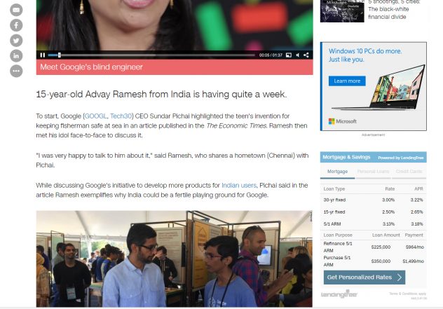
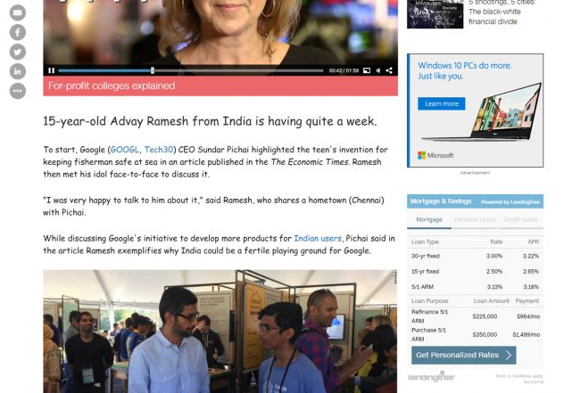
images from cnn.com
Knowing your audience will tell you a lot about what your font should be. If you are writing for children by all means use a playful and chunky font. If you are writing for a fashion magazine something more stately like a serif font will be beautiful.
But in any sort of design work, physical or digital, you usually want to have more than one font working together. This allows for some diversity and adds more interest to the piece. That’s precisely why wordpress gives us so many header options so that they can be styled differently.
However, you don’t want to go around pairing just any fonts together. Some pairings don’t make sense and just aren’t a good match, like these two on the left. In my opinion they are meant for two very different audiences, thus don’t work in a visual sense.
The two on the right, though very different in structure, offer a nice balance to one another. You can tell that it’s a feminine design, because of the cursive font, but there is also an element of seriousness, like “I mean business”, by using the serif font underneath to help ground it. Font pairing like this one are very popular in the blogging world and now that you know why, you’ll start recognizing them all over the place.
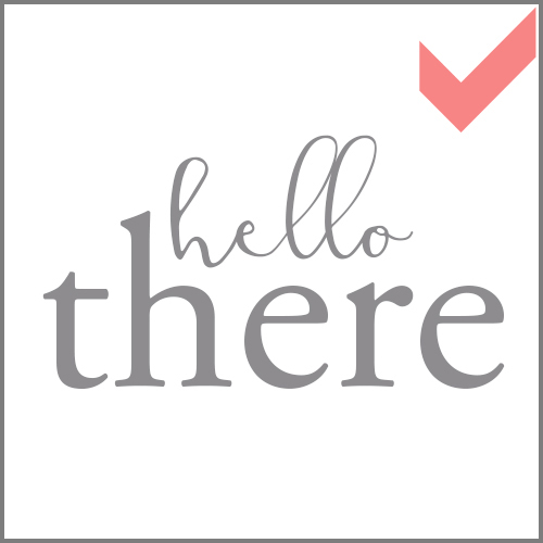
fonts: baby fox reg + Verdana Bold Italic

fonts: Modesty Reg + Garamond Pro
Another thing to remember when pairing fonts is that they shouldn’t be too similar. Items that are very close to being the same but that are just slightly off will undoubtable confuse audiences. Even if they don’t know why, their brain will register that something subtle has changed and it will be unsettling.
For instance, these two san serif fonts on the left are so similar that their differences start to stand out in an unappealing way. They don’t compliment each other’s differences and actually just end up looking quite plain and boring. No thanks!
But take these two mixed fonts on the right. Their structure is so different that they are NOT clashing, but rather complimenting each other. Think of this as wearing a red sweater with pants that are slightly a different shade of red. It would bother most people. But wear that sweater with a black pair of pants and there is no clashing or issue!

fonts: Sitka Banner Bold + Canter Light
Sidenote: Logos are kind of their own deal and follow some of the font principles, but the rules can easily be broken. If you pair fonts in your logo, obviously they should work together, but so many other factors are involved in a good logo that are beyond the realm of fonts.
Let me know in the comments if you want a post on logo design.
Color
Now that we have our font pairing down pat, let’s move on to balancing our color. Color can be made super easy nowadays thanks to pinterest and the infinite amount of colorways that you can scroll through.
In my opinion, there is not *necessarily* a wrong way to use color. I say this because everyone tends to like different colors. So why the hesitation? Well, because color can be a very quick way to date your work.
Think about in the 90’s and early 2000’s. The hip thing to do for a website was to have a stark black background and neon colored font. Yikes! I blame Myspace for most of this. Sadly I still run into clients that have websites that look like this.
Today the common practices is a white or light grey background, with a minimal layout and the rest can kind of be whatever you want.
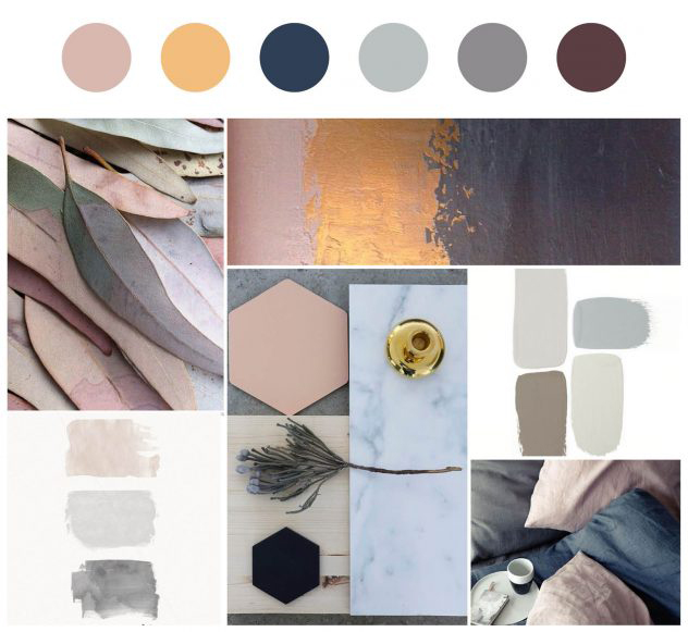
I do recommend when balancing your color palette to pick a couple of colors that fall in the same color family (all neutrals or all pastels), or that are versions of the same color (like different shades of blue). Then pick an accent color, something different that will really pop (but not clash) with your first choices (for instance navy and maroon are beautiful for fall). And then lastly, choose a color that is different in either hue or gradient than the others (if you have all dark colors choose one lighter soft color or vice versa).
If you need a little bit more help there are great resources online like Paletton that will help you generate a color palette.
Images
Photography can be a HUGE asset to you in the building of your website as well as your social media. Most people are visually inclined, so photography will grab their attention. Of course, if you want good attention you want good photography.
Here is where we will start talking about visual hierarchy. Visual hierarchy is important in every aspect of design (I actually used it in my font examples, you just didn’t know it), but really comes out to play when using images and layout, which we will get to.
Visual hierarchy is the path that our eyes naturally take when looking at an item. Most of us read from left to right, and from top to bottom. Even when looking at photographs, our eyes quickly scan to find the focal point before moving on. If the focal point is easy to find and pretty to look at once we find it, we tend to stare at it longer.
The trick to getting a balanced photography is to follow the rule of 3rds. Some of you probably know about this, but for those of you that don’t, basically that means if you were split your image into equal thirds your subject matter should line up with the thirds, relatively speaking. This will give an even layout to the photograph and will frame the subject matter in a way that makes sense to our eyes.
Here are some of my own photographs that follow the rule of 3rds.
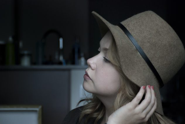
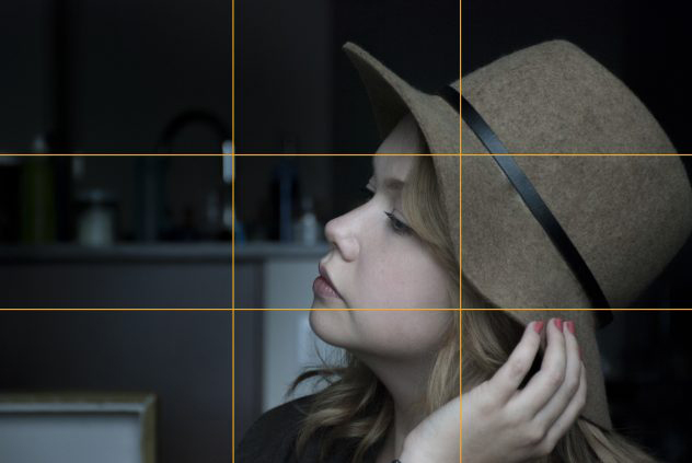

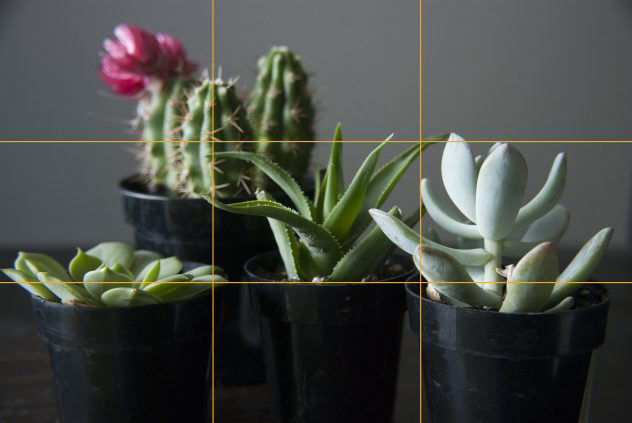
With practice this becomes habit and you don’t have to think about it.
Graphics
Most people add some sort of text or graphic to their images to share on social media. Believe it or not there are rules for this too! There is a reason some pinterest photos get more attention than others and it all has to do with balance.
But balance doesn’t always mean, everything is perfectly centered. Actually, you can make your graphics pretty interesting by playing with the symmetry of things.
Here are two good examples of balanced graphics:


My pinterest graphic has everything aligned to the center, both vertically and horizontally. But the ad for Tailwind has their headline aligned to the left but it is balanced with their branding off to the right. This can be tricky to do correctly, so when in doubt stick to centering most of your work.
Layout
Oh layout, where things get crazy yet so fun. Visual hierarchy becomes SO important here. This is how people will read the layout and you want it to be as natural as possible. When eyes have to jump around and piece things together, it can get confusing.
When laying out photos, in a post or in a book/magazine, grid layouts are the most common. You can either have a very structured grid that is symmetrical, like my about page on the left, or you can have some fun with it and have a more random asymmetrical layout like my example on the right.
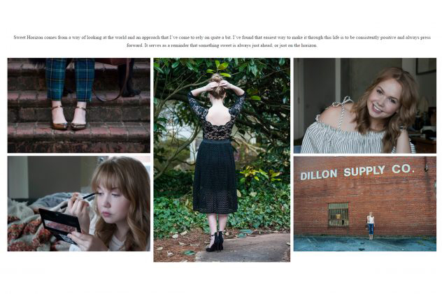

Both are great, but when creating an asymmetrical layout, balance all large images with a couple of smaller ones and try to leave equal space between each photo.

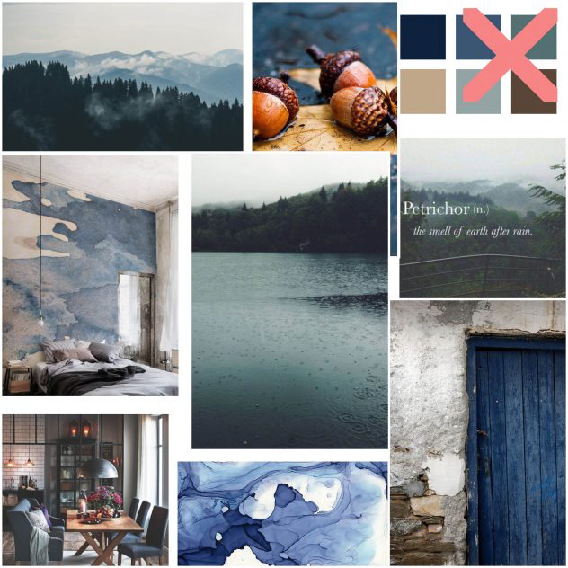
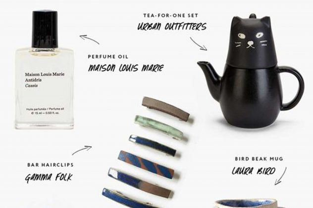
Even if you are doing a sort of scattered, flat lay type of layout for a post, there should be a natural flow to it and the written info should be easily paired with it’s picture so that people aren’t guessing which item goes with which description. Some people will even use arrows or graphics to connect descriptions and images, like this layout from Miss Moss.
Layout can seriously get so complicated that I could probably have a post just about this. When adding font, photos, graphics, you name it, to a design you basically have to take everything we’ve talked about and make it all work together. Font pairings need to be functioning properly; where you place them within your layout can have a HUGE impact on your visual hierarchy; your color choices need to balance out the colors in your photos and graphics; and the image/graphic is usually the focal point and shouldn’t get lost under the rest of it.
Do you see why crazy people like me go to school for this stuff? The list continues, but I will leave you with three layouts that I really think are good examples of balance.

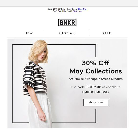

Let me know in the comments if you want a post just on layout!
Website
Here we are, the big picture. If you are still with me, I applaud you!
Websites combine it all! That can sound super intimidating, but it doesn’t have to be.
The basics:
+ Your website should use fonts that are easy to read and that attract your ideal reader.
+ You should also use the same color palette throughout your site to that it looks like a cohesive unit. That’s just good branding.
+ You website should have big and powerful images that draw your reader in and keep them scrolling through your pages.
+ If you include graphics into your marketing strategy, make sure they look professional and represent you well. Again, when in doubt, centering is your friend!
+ Take the time to make sure your post layouts make sense and are easy to read. Readers should not have to jump around the screen to follow your post.
And when I say all aspects have to work together, I mean you header, content, sidebar, footer, everything, should look like it belongs. Nothing should feel out of place. If it does, try a different approach on that section.
Look at these two mock websites I have here:
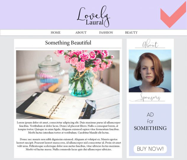

Oh there is so much wrong with this (totally made up) website on the right side. The fonts and colors clash and don’t follow her branding at all. There’s actually not much wrong with her actual content other than the fact that her choice of photo is so muted and get lost in the whole layout. Not to mention that the sidebar and ads drastically take the focus away from the content, which is never a good thing. In fact they are downright distracting! We don’t have to necessarily replace the blog image, but if we were to change it to something more visually interesting it would be sure to catch the reader’s eye. We also need to edit the sidebar widgets and the ad (most places will give you options or you can ask if you can design an ad for them that fits your theme), fix the font choices and just give this blog a little bit of a face lift. Now the blog post becomes the center of attention, just like we want!
Granting, this imaginary website still has a ways to go, but it’s definitely a step in the right direction!
And when all is said and done, take a step back and see how your website looks all together. Does it make sense, or do you get lost in it? Does it transition nicely or jump from one thing to the next too quickly, making it jarring to look at? If you were a reader, would you want to click through the posts, or bail after the first page?
If you feel confident that things are in order, then just keep cranking out great material! If something feels off, or you aren’t quite happy, then keep working at it until you get it! Practice makes perfect with everything, including design.
We’ve really skimmed the surface here in terms of design, but I hope this gives you some idea on where you should be headed when trying to balance your blog’s design and really start to understand visual hierarchy.
If you still have questions about something that I didn’t cover, leave a message in the comments for me!

Pinterest
follow along:
/
Instagram
/
spotify