Winter 2022 Graphic Design Trends
Trends come and go and graphic design is certainly no stranger to the ebb and flow of what is currently “on trend”. A quick scroll through the design communities of Instagram or Pinterest and I’m sure you’ll start to pick up on some of the design trends that designers can’t get enough of.
I’ve decided to start looking into some of the trends I’m loving throughout this year as a way of sharing some inspiration with you all and also to jumpstart my own creative process. It’s always fascinating to see the things that people collectively gravitate towards and I hope that you’ll find this series as interesting as I do!
Are you someone that follows the trends? Or do you try to steer clear of trends and pave your own way? Let us know on Instagram!
01
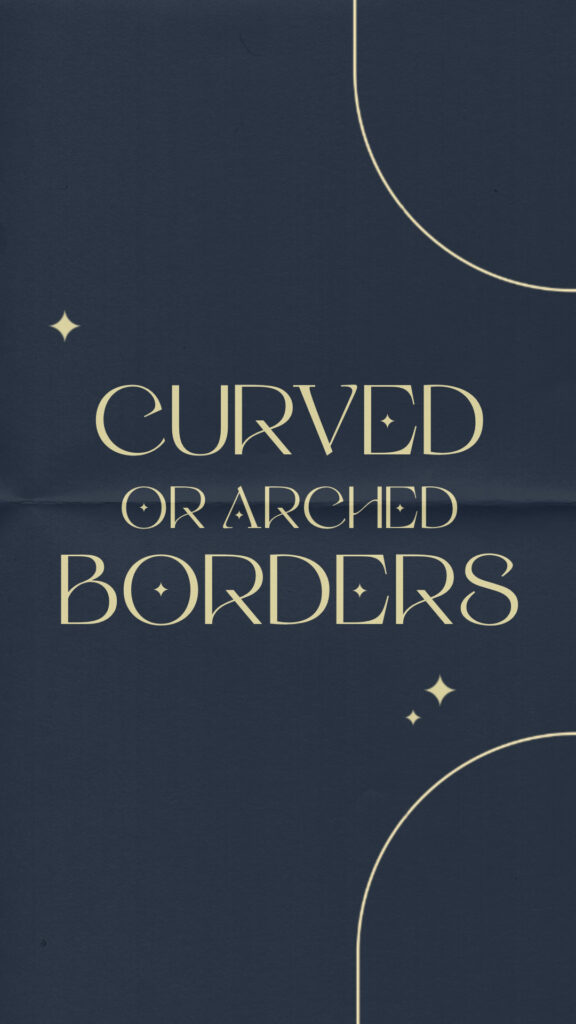
Curved or Arched Borders
Arches have been on trend for awhile not just in graphic design but in interior design as well. As this trend has evolved we are seeing arched color blocking, arched images, and arched or curved borders instead of the typical square borders. This allows borders to be a graphic element on the page in a fresh and satisfying way. Borders can be added to compliment or contain your content but rounding the corners a bit can make even more of a brand impression.
02
Jewel Toned Colors
Deep color palettes of all kinds are in right now including deep warm tones as well as saturated jewel tones. Basically, bold color is the main trend here! We are seeing more and more colorways being created with a only a few light accent colors but mainly focusing on beautiful saturated and rich color choices. Don’t be afraid to introduce a bold jewel tone into your content!

03
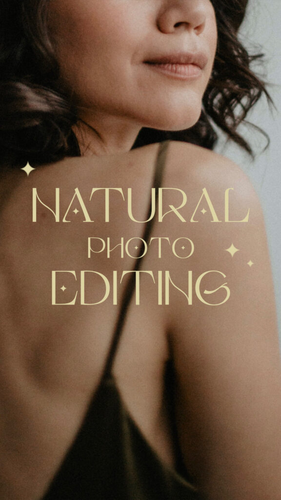
Natural Photo Editing
Photography plays a huge role in graphic design (just one of the many reasons we LOVE to work with photographers)! Right now, natural photo editing, specifically photo editing to achieve a natural skin tone, is an absolute must. With more of a push to show up “authentically” on social media and throughout all content these days it’s more important than ever to really look like yourself in your images. Window lighting or outdoor settings are a calling card of this trend, so leave your studio lighting off to the side for right now!
04
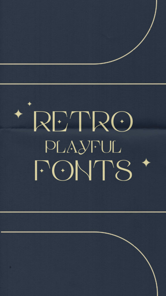
Retro Playful Fonts
Retro fonts are here and don’t seem to be going anywhere anytime soon! More and more font creators and graphic designers alike are gravitating towards more playful, expressive styles when it comes to font choices and you don’t have to look far to see new takes on the bubble lettering or swirling typography from older decades being repurposed for this new trend. While this trend may end up looking… *ahem* dated… sometime soon, these fonts are certainly fun options to add to your collection or to create a memorable brand statement.
05
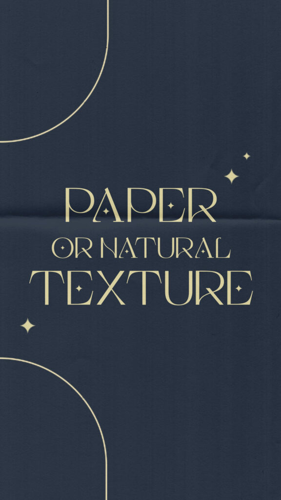
Paper or Nature Texture
There has been a big push in the last few years to include more natural or textural elements into digital spaces so with that we’ve seen a bigger influx of paper, sticker, and cloth textures added to otherwise digital designs. This trend started as a way to visualize products in a real world sense through mockups but it can now be seen as a staple in a lot of designers’ portfolios lately. Again, with a push for “authenticity” throughout content right now, it makes sense that viewers love to see real world examples of graphic design work, even if the texture is added after the fact.
06
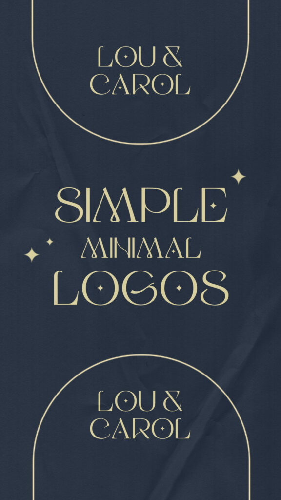
Simple Minimal Logos
Minimal is in. You see if across the board with layout designs, brand assets, and, most notably, logo designs. Many brands are ditching overly styled, sometimes convoluted, logo designs in favor of sleeker, simpler structure. This allows for a clearer brand statement, possibly the introduction of a brand font, and certainly for a more easily recognizable name. Some of these logo are nothing more than a typed out name in a specific brand font. I say, if it represents your brand clearly and effectively and resonates with your intended audience, a simple minimal logo can be just what your business needs.
So what do you think of these design trends? Any you are loving right now? Any you are wishing would move on already? Let us know on Instagram!
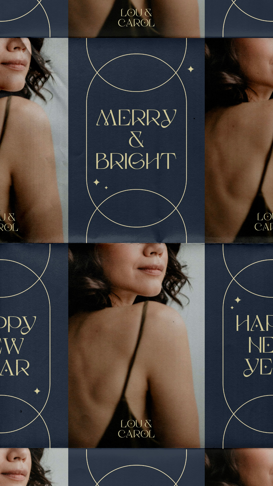
And enjoy this fake brand, Lou & Carol, I created specifically for this blog post to show off all of these winter design trends together!

Pinterest
follow along:
/
Instagram
/
spotify